BIANTYX NUTRITION
Digital Commerce Experience
Designing a shopping experience that transforms complex information into clearer decisions.
Not yet measured
01Project Overview
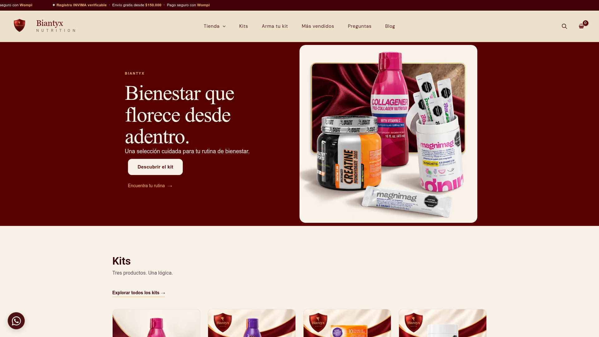
Biantyx Nutrition is an e-commerce experience specializing in nutritional supplements, designed to connect product discovery, consumer education, and digital purchasing.
The project addresses a common challenge in the wellness market: offering a wide range of products without turning the shopping experience into a confusing search through ingredients, formats, and stated benefits.
The solution brings together a store organized by category, themed kits, an interactive interest-based guide, and an experience that allows customers to build personalized product combinations.
02The Challenge
Buying nutritional supplements involves making decisions based on information that may be technical or difficult to compare.
The challenge was to design an experience that facilitated three tasks: discovering relevant products, understanding their characteristics, and moving toward an informed purchase.
It was also necessary to balance commercial conversion goals with information transparency, which is especially important in a category related to health and wellness.
Design question: How can we help people explore supplements intuitively without confusing a commercial recommendation with medical advice?
03My Role
My work focuses on connecting Biantyx Nutrition's commercial strategy with the customer's digital experience.
The work encompasses conceptualizing the e-commerce experience, organizing the offering, defining discovery journeys, and structuring features that facilitate product selection and comparison.
The approach combines product thinking, user experience, commercial communication, and a vision focused on building functional digital solutions.
04Discovery
The starting point was to analyze the barriers someone may encounter when buying supplements: unfamiliarity with categories, difficulty comparing products, and the need for reliable information.
Three needs were identified as design hypotheses:
- Guidance: find products based on interests or needs stated by the user.
- Understanding: access the characteristics, formats, and information for each supplement.
- Trust: learn about purchase terms, health information, and relevant warnings.
These hypotheses guide the experience architecture. They are not presented as conclusions from interviews or formal user research.
05Design Process
The experience was structured around different ways to discover products, rather than relying exclusively on a traditional catalog.
Journeys were considered for people who know which product they are looking for, those who prefer to explore a category, and those who need guidance to get started.
This approach takes shape in category-based navigation, featured products, themed kits, and an interactive guide.
The design also includes a feature for combining supplements into personalized kits, allowing users to review products, quantities, and discounts before adding them to the cart.
- 01
Interests & categories
- 02
Product information
- 03
Kit selection
- 04
Cart
- 05
Checkout
Illustrated from the supplied narrative; not an original project artifact.
06Key Design Decisions
1. Organize by interests, not only by product names. Categorization into areas such as sleep, performance, or digestive wellness makes the catalog easier to explore.
2. Include an interactive guide. Users can select their interests and explore product options without needing to create an account.
3. Offer preconfigured and customizable kits. Kits reduce the effort of exploring combinations, while the custom builder preserves freedom of choice.
4. Make commercial terms visible. Quantity discounts, payment methods, policies, and shipping terms help reduce uncertainty.
5. Separate commercial guidance from medical advice. The experience communicates explicit limits regarding the guide's educational purpose and the nature of supplements.
07The Solution
An e-commerce platform that brings different shopping journeys together in a coherent experience:
- Catalog browsable by category.
- Interactive guide based on consumer interests.
- Preconfigured product kits.
- Custom kit builder with discount rules.
- Product pages with relevant information.
- Cart and checkout process.
- Educational content and frequently asked questions.
Project evidence
08How I Used AI
The project is a suitable case for documenting the use of AI tools in concept exploration, content structuring, prototyping, and refinement of digital experiences.
The approach is to use AI to support and accelerate design and development tasks, without delegating decisions about sensitive information, content clarity, or experience quality.
Specific tools and activities: to be documented using the actual project history in order to show verifiable examples of the process.
09Validation
The existence of the site makes it possible to review actual journeys such as exploring categories, using the guide, building a kit, viewing products, and proceeding to the cart.
Impact validation requires supplementing this functional review with usability testing and commercial analytics.
The main proposed metrics are use of the interactive guide, interaction with the kit builder, add-to-cart rate, purchase conversion, and checkout abandonment.
No conversion improvements are claimed without comparative data.
10Outcomes & Learnings
The tangible result is an e-commerce experience that goes beyond a conventional store by incorporating guided discovery, kit customization, and visible trust mechanisms.
The main design takeaway is that when products require explanation, the user experience should help people understand before trying to convert them.
It is also a reminder that a responsible commercial interface must communicate its limits clearly and allow people to retain control over their decisions.
Status: public website. Commercial results and usability metrics remain to be documented.
Not yet measured
Next project
CAMPO APÍCOLA →